The Art of Nature and the Nature of Art
  • Musings on Life and Work in Progress
  • Find my gallery
  • Contact Me Directly

Plumbing Depths

6/2/2016

0 Comments

 
Picture
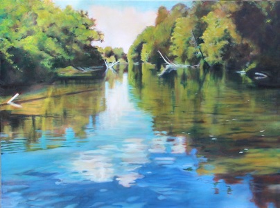
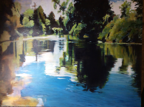
"The Cradle Endlessly Rocking" #2. Oil 30 x 40
A friend asked me today about how I create glow on water. I wasn’t sure how to answer. It’s certainly something I aim for, but it’s tricky. For one thing, the surface of a body of water (a placid lake in particular) functions as a huge mirror which captures sunlight and sends most of it, but not quite all, back. So I’ve spent the day thinking about the question and have a few ideas.

For one, I realized that I rarely paint water photographed on a cloudy day, and virtually never paint muddy water even if it is sunlit. I grew up beside two rivers which were full of sediment and wanting to paint them or even photograph them never crossed my mind. What I do remember is studying clear puddles when I was very young because the water brightened and amplified the colour of the pebbles at the bottom. THAT was worth looking at. So the allure, the glow, of water has something to do with transparency. In "The Cradle Endlessly Rocking” #2, I was interested in what I could see of the river bottom and the colour of the deep water, visible on both left and right centres where the river lies in shadow and cannot reflect the sky.

In full sun, on the other hand, the river or lake wears the sky and flaunts its dressed-up self. Above us at the peak of the sky's dome are found the deepest blues, but I also watch for the lighter, more turquoise, blues near the horizon if they haven’t been blocked by trees. There is rarely an opportunity to display the zenith blue directly unless it is a prairie scene. Painters like Dorothy Knowles from Saskatchewan are famous for their extremely low horizon lines; the prairies’ glorious unobstructed sky is the main attraction and needs height to strut itself. Those of us painting in the heavily treed East have to settle for the reflection of that special blue. “The Cradle” has large areas of reflected deep sky blue but only a hint at the very top of light sky itself. My interest was in the water.

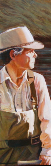
The last element of painting water, I think, is paying attention to whatever is floating on top. My waterlily paintings often include the tiny insects that no self-respecting lily is without. Other times small wavelets (n.s.w?) such as those generated by someone standing in a current are critical to reading the river correctly. You will begin to see these in the last painting sessions on “Down in the Gorge”#2. Some artist friends had trouble interpreting what they saw in the early stages, possibly because the photo was taken almost directly above from a high bridge on a sunny day. As a result of the almost 90% angle and strong light, there is no sky reflection and everywhere the sunlight penetrates through to the river bottom. Jon is casting in the main channel, where the strong current has swept away almost all of the duff. To either side of him, however, the current is slower and the river bottom is dark with debris. I am hoping that judicious application of small white high-lights wherever the flow is interrupted will make it clear that he is knee deep and that the entire canvas is a water scene. In “The Cradle,” my last brush strokes added the white flecks on the surface. I am still unsure of what they were; I simply knew they had to be there.

I think I may have just explained to myself why I need a rest-cure after painting a large water scene.
0 Comments

On Faking It  #1

4/2/2016

0 Comments

 
Picture"Homage to Tim Fitzharris" oil 24 x30


Last summer in the company of a very bright, engaging person who knew a lot about botany, I commented that I wanted to locate a particular wildflower because I couldn't remember its habitat and wanted to paint it in situ. Without a backward glance, she said "Just fake it. That's what art's about."

No.

Let me think about that.

No.

Let me first admit to personal bias.  Looking at  anything generic makes me long for specificity. If I am painting a maple tree, I try to capture its grandly symmetrical shape;  botanists refer to this quality as "opposite rather than alternate".   The pagoda trees  which volunteer on our property with predictable regularity should, on the other hand, look as if they are built on the principle of alternate but equal, like a tai chi stance;  I like them best set against a light backdrop like our neighbours' stucco, where in winter their elegant shapes sing.   I want white pines to be tall and irregular, their longest branches pointing to the south-east (in a pinch, a mature white pine can function as a rough compass if you are lost in the woods).  And tree trunks ALWAYS  have straight parallel edges and never taper up.  Point being, tree species have some things in common but many many differences.  In October you would never confuse a poplar forest with a maple-beech forest.  You would sense something is wrong but perhaps not what is wrong. It just doesn't feel true to your experience.

I propose that Art is about TRUTH of some sort.   So our next job is to think more about what constitutes artistic truth.  Let's begin by agreeing with Gerhard Richter's assertion that "I believe that art has a kind of rightness, as in music, when we hear whether or not a note is false."   The "bright, engaging person" may not have been an artist but I am pretty sure that she would have been vaguely bothered by the painting of a fake plant.

​More on this topic in March.  Good-bye February!!

0 Comments

No Ginger, I

15/9/2015

 
Picture "The Ancients" #2 glaze oil 30 x 40
Hello again.  I've been AWOL for a while.  I'm here to ask a favour.  Just as you know to remind me never to paint either another violin or a harbour scene with ships, would you please add "Never paint another ancient tree with gnarly roots and a partial reflection."  Yes, I do admit to a weakness for exposed roots and their reflections.  I waited three years for a second crack at this cursed image, which I had glanced once before;  it necessitated perfect weather on the right river and a quick dropping of the paddle to take the shot.  Had to merge two, as it turned out, because Jon sterns robustly, but finally I had a working look at "The Ancients" #2.  .

Getting the shot turned out to be the easy part.  One of the challenges of landscape is maintaining the balance between overview and detail.  The gorgeous roots that drew me are now driving me crazy.  Unlike Ginger Rogers, who was praised not only for dancing with Fred Astaire but doing it backwards and in high heels, I am having trouble even finding the beat.  To put it bluntly, the grisaille has been grisly.  It's like being lost in a maze.  Now add a gazillion maple leaves (sugar maple, to be exact) and l'm inventing reasons to avoid my easel.  

On the plus side, the drawers in this house have never been better organized.
  
Just last week the final piece of new furniture was dry enough to move inside.  Nothing like a small house to turn you into a cheap date when it comes to storage;  beholding these empty drawers gave me frissons of delight.  Filling them was even better.  Now, to reward myself for ten minutes on sorting out roots and leaves, I simply open a drawer and feast my poor crossed eyes.  For the first time I have all of the paints - oil, acrylic and watercolour - and all of the brushes within reach (except for my favourite brushes, which are currently residing in The Land of the Missing.  Oh well.  At least I now know where they aren't.)  Even my gloves have their own drawer.  Life doesn't get much better.

So pity me not, dear friends.  It may be Christmas before I paint myself out of here, but I have my gloves to keep me warm.


That Time of the Year

3/9/2015

 
Picture"Miss Beef" glaze oil 8 x 8
I bought a half-bushel of roma tomatoes today in a fit of optimism.  Ask me if I can can (not the dance)  or make tomato sauce.  No.  Let me think about that...   Still no.  And there they sit, sullen on the kitchen floor, guessing their fate.  I just couldn't help myself.  It's that time of the year.

Just as I buy pears to paint around Christmas, I buy tomatoes in September.  They are just too gorgeous to ignore, winking at me from their glossy piles at the grocery.  I so love ripe tomatoes that  I even painted myself a big fat fall tomato which hangs in our kitchen year round to remind me of what tomatoes should look like.  I was a spoiled child.  My dad grew huge beefsteak tomatoes, harnessing the light and heat reflected off the house's white stucco.  We ate tomato sandwiches almost every day. This cadmium red bounty lasted well into November because my parents harvested all of the green tomatoes before the first frost and carefully wrapped them in newspaper, where they obligingly ripened.  At the time I thought this was quaint; now I realize it was smart.  The pink plastic tomatoes of winter have humbled me.

So I shall settle today's beauties into a pretty blue bowl and take lots of pictures.  I may even tart them up with a few equally gorgeous eggplants.  Did I mention that I bought half-bushels of them, as well as of red peppers?  It was only as I began to rehearse ratatouille recipes in my head that the penny dropped:  all three are fruits of the solanaceae family or nightshades.  This matters only because they have been associated with arthritis, something I have only in September.  Funny, that.

Should you decide nonetheless to risk immortalizing and then eating a tomato, there is one other health consideration:  cadmium is a heavy metal.  One of the many things I owe to Kathy Bailey is a safer palette.  Her red is alizarin crimson, considered by ASTM to be harmless, although I think it's fair to assume that they don't expect you to eat it.  If combined with a touch of transparent yellow and glazed over white, a highly serviceable tomato red can be created.   

However you use them, do enjoy your tomatoes;  it's definitely that time of the year.

More than Dragging Trees or Dead Calves

10/8/2015

 
Picture"First Valentine: Anne and Marie" glaze oil 12 x 12
The unreliability of memory has been this week's theme.  I reconnected with a dear old friend by email and we began to reminisce.  Trouble is, we had widely differing memories of important events and I have been starting to wonder about parallel universes.  Certainly, the literature about brain research makes it clear that, while perfect memories may be stored, their accessibility is a different matter.  What did remain true was the remembered emotion:  we liked each other enormously and somehow affected one another's futures.

So what part does art play in this fragmented game?   Picasso saw painting as autobiography: "I'm like a river that rolls on, dragging with it the trees that grow too close to its banks or dead calves one might have thrown into it or any kind of microbes that develop in it." 


"Dead calves"??   A powerful image but it doesn't reflect my relationship with memory.  For me painting is the attempt to record those splendid moments when the love of life overwhelmed all else.  Doomed to failure, I am nonetheless drawn like a moth to those joyous experiences which light up my brain.  The invention of digital photography was essential in this because those of us who embrace reality may need a little help in catching that moment of perfect light.  


This small (12 x 12) painting is of my beloved niece and her dear little Marie.  They were in our living room  shortly before Christmas and a shaft of low December light broke through.  Anne, who is a wonderful mother, glows with love, and the painting which ensued began my "First Valentine" series of mothers and their babies.


Every painting of mine is filled with emotion, the truest part of memory.  Otherwise, why bother?

Floating across the Canvas

25/9/2014

0 Comments

 
I've been musing about the relationship between shadows and reflections. They share many properties and both sing when they are full of colour. This painting in progress contains both, but the shadows are so deep as to be nothing but colour: their black transparent depths can be achieved only by multiple layers of the primaries. This time, however, it's the reflections that delight me.


On the right, the calm water captures the face of the land and shimmers in delight. Nothing is distinct. This restful scene is where I want the eye to begin. Then the current begins to pick up on the lower right and then moves purposefully on the diagonal rising to the left. Strokes of paint convey the angle and forceful direction. That strong current traces the deep channel, which swings back around, up and towards the right. This focal area is where I've placed the hardest edges, the greatest detail and the highest contrast.


Once the river rounds the bend and disappears mid-top, I hope the viewer's eye will naturally complete the ellipse and return to the peaceful opening act..


At least........that's the plan! In the meantime, you will note that I have unconsciously echoed that progression in my work (which normally proceeds left to right). It's been a busy week and I'm longing to get to that side of the canvas but life does intervene, doesn't it.

Picture
right half close to being finished -- far left only has colour foundation and a long way to go!!
0 Comments

Just Around the Bend

7/8/2014

0 Comments

 
Picture"Blue Road" 30 x 30 oil on canvas
There is something magical about roads which, in the distance, gently turn and disappear.  One is left with the mystery of what a traveller might discover on such a road;  Robert Frost certainly chose one.  One of my favourite poems, "Curiosity," contrasts  the stodgy "dog" (who prefers "well-smelt baskets and suitable wives") and the adventurous "cat" (who needs all nine lives because curiosity causes him "to die again and again/ Each time with no less pain").     I know myself to be a dog but I do admire cats,  and I do stand and ponder paths which meander away. 

This particular oil is based on a photograph I took a century ago on Salt Spring Island.  We had rented a house near the north end of the island;  naturally, Jon had brought his bike and his fishing rod so he was often away and I was happy to to paint or to hike the almost deserted road.  It was an unusually grey winter and the area was heavily forested. But one day the sun broke through and turned the road blue.  This painting is a celebration of that moment.


0 Comments

Sun and Shadow

16/7/2014

0 Comments

 
When we visited Newfoundland the first time, we pretty much stayed around the Avalon Peninsula.  Of course, we hoped to see whales and puffins, so a trip to Bay Bulls was on the menu.  The day was sunny and off we went.

As the crowded tourist boat started out, we passed long lines of cliffs;  everyone seemed to move to the prow but I had already become interested in the cliffs and the water.  It must have been around noon (or noon:fifteen in Newfoundland...) and the sun was shining straight down into the sea, which was shot with turquoise and jade.  Elegant shapely white-trunked trees, many long dead, clung to the sides, and near the water's edge were the shadows' secret darknesses.   It had a warm Mediterranean feel.


As the boat continued out toward the deeper water, I remained interested in the deep-toned and stained intricacy of the rock formations and continued to take picture after picture. Then suddenly, it seemed, cloud cover pulled down the shades and the entire scene changed.  The palette changed and rusty reds and the drab greens of algae and mosses now predominated.  Part of the world's mantle must have shifted at some distant point in Geological Earth Time and this section had swung sharply down towards the water or perhaps been thrust up above it.  The terrain was rough, cold and unforgiving.  Northerly.

When we returned home and I looked through the hundreds of digitals, these two stood out.  I painted them on 30 x 30 canvases, intending to hang them as a pair.  For obvious reasons, that didn't work.  Who would ever believe that I had seen these two scenes only a few minutes apart?  They had nothing in common beyond size, rocks and water.

A good friend and enormously talented artist, Simon, was interested in the second painting and offered me one of his brilliant urban paintings in exchange;  it too is of a dull day  -- in fact one of pouring rain -- but the predominant shade is deep turquoise.  When I was four my best friend and I used to argue about who was going to be "Mrs. Turquoise" that day.  I won about half the time;  now I'm batting a thousand every day.
Picture
"Bay Bulls" 30 x 30 oil
Picture
"Bay Bulls" 30 x 30 oil
0 Comments

Doors Open

5/7/2014

0 Comments

 
Picture"Krug Sugar Shack" acrylic 16 x 20
Our house has an open door policy.

To be more accurate, Jon does.

Prairie children are raised with a few simple commandments:  "Don't let the heat out"  (October to May) and "Don't let the mosquitoes in"  (June to September).  My father was equally clear about never slamming car doors.  Resistance was futile.

Judging from my limited experience, however, Southern Ontario offspring must have had an enchanted door-free childhood.  If he thinks of them at all, my spouse views doors as benign spirits which make no demands and hold no fears.  In fact he has doors which miraculously close themselves, an outcome ensured because he had the great good sense to marry a prairie girl.

It is simple operant conditioning.  On hearing the storm door open, my autonomic nervous system goes on high alert.  My radar instantly detects a phalanx of mosquitoes hovering just outside.  Without straining, I can hear the triumphant "Its HIM!" followed by a chorus of tiny giggles.  And so it goes.  Just exactly what choice do I have but to put down my coffee (brush, scalpel, blowtorch, icepick -- your choice) and run to breach the assault?

To spare you what follows, I shall immediately skip to my point, which is that you should not expect to see a painting of mine which figures on an open door.  Even if the building is a deserted sugar shack with broken windows, the door will be gently but firmly shut.

Dad would be so proud.

0 Comments

Painting for Men*

25/6/2014

0 Comments

 
Picture"Reading the River" #1 oil 10 x 30


I remember feeling happy when I finished the first "Reading the River."  Feeling that the portrait had caught Jon, I took it in to him, planning on reaping some well-earned praise.  My beloved's first comment put paid to that:  "Why can't you see more of the split-bamboo fishing rod??"  "And where is the reel? -- it seems to be entirely missing!"  Yes, he did go on to admire the portrait and he did confer on it his highest praise in the form of declaring it his and not to be sold.  But the experience gave me something to think about.  Not just murder, either.

Men are all about the gear.  While I view it as an aesthetic embellishment,  Jon sees fine gear as an expression of reverence towards tradition and fine workmanship as well as the key which unlocks fishy secrets.  I do admit that he makes a handsome, if expensive, sight on the water.  But a portrait doesn't normally choose its focal point below the waist.  I painted that photo because of the light differential between the right side and the deep shadowed skin tones.  He just happened to be holding a rod. The only reason it was at all visible was to make sense of the waders.

My marital experience does highlight the painterly gender gap.  No wonder there are damned few married women represented in the National Gallery.  Any national gallery.  Instead there are thousands of uncelebrated married female painters (Jon calls me his "paintress" when he's feeling reckless) who perished unknown because they couldn't figure out how to add cars, whiskey decanters or fishing gear to their florals.

Which one should I use for the background to the new painting of Baby Rose in her bunny hat?  

*I echoed the rhythm of this title from one of my favourite books of humour - Golfing for Cats by Alan Coren.  In addition to his irrelevant title choice, Coren put a large swastika on cover, counting on the bookstore's having to stock it in four departments - humour, sports, pets and history.  Inspired.


0 Comments
Forward>>
    Picture

    Archive

    July 2023
    April 2023
    March 2023
    February 2023
    January 2023
    December 2022
    November 2022
    October 2022
    September 2022
    August 2022
    July 2022
    June 2022
    May 2022
    March 2022
    February 2022
    January 2022
    October 2021
    July 2021
    March 2021
    January 2021
    December 2020
    November 2020
    October 2020
    October 2019
    September 2019
    August 2019
    July 2019
    June 2019
    May 2019
    April 2019
    March 2019
    February 2019
    January 2019
    December 2018
    November 2018
    October 2018
    September 2018
    August 2018
    July 2018
    June 2018
    May 2018
    April 2018
    March 2018
    February 2018
    January 2018
    December 2017
    November 2017
    October 2017
    September 2017
    August 2017
    July 2017
    June 2017
    May 2017
    April 2017
    March 2017
    February 2017
    January 2017
    December 2016
    November 2016
    October 2016
    September 2016
    August 2016
    July 2016
    June 2016
    May 2016
    April 2016
    March 2016
    February 2016
    January 2016
    December 2015
    November 2015
    October 2015
    September 2015
    August 2015
    July 2015
    June 2015
    May 2015
    April 2015
    March 2015
    February 2015
    January 2015
    December 2014
    November 2014
    October 2014
    September 2014
    August 2014
    July 2014
    June 2014
    May 2014
    April 2014
    March 2014

    Categories

    All
    ALLA PRIMA PAINTING
    ANIMALS
    ART SHOWS
    BOOK RECOMMENDATIONS
    CHRISTMAS
    COLOUR THEORY
    COMPOSITION
    GARDENING
    GLAZE OIL PAINTING
    HOW SHAPE MATTERS
    INSPIRATION
    OUTDOOR LIFE
    PALETTE
    PHOTOGRAPIC REFS
    PORTRAITS OF CHILDREN
    PORTRAITURE
    SEASONS
    STILL LIFE
    SUBJECT MATTER
    THE FUNCTION OF TITLES
    THE HUMAN COMEDY
    THE ISSUE OF SIZE
    THIS OLD HOUSE
    TREES
    UNDERPAINTING
    YouTubes

    RSS Feed

Powered by Create your own unique website with customizable templates.