Until I started to paint, I never gave much thought to how colours were created. Of course I had my favourites, but I kept running into trouble whenever I tried to put together an wardrobe, if my closet could be dignified with the name. Inevitably, those two "turquoise" items didn’t match let alone play nicely together, and reds were even worse. Sometimes I could get away with it by choosing a plaid or a tweed but I doubt that I was the only person lost with no hope of exact colour coordination.
It wasn't until I began to paint that the penny dropped: there were simply endless possibilities of colour mixing. Perhaps the biggest surprise was black. I had been taught that it was the combination of all colours, but then so was brown. When I began painting in oil it became clearer that black lacks white, while brown invites it, even if it's just a bit. But black, the "darkest dark," has an ace in the hole: its tremendous value when set next to the "lightest light" to highlight a focal point. Easy peezy. Black's a star.
But not so fast! Nobody I know simply buys a tube of black and uses it indiscriminately. For one thing, even there lurk dragons — did you want “lamp” black, “ivory” black, “mars” black or “perylene” black? Each has a specific use. More importantly, simply applying black out of the tube is a recipe for fatal boredom. The best paintings contain dancing moody blacks. What that means is that while the three transparent primaries certainly can produce a perfectly balanced telephone black, it’s much more interesting to tweak the mix so that one or two of them dominate in a way that complements the surrounding elements.
This is what’s known as “chromatic black.” For example, I have a weakness for dark backgrounds in botanical painting; they pop the main attraction forward because most flowers are on the bright side. But I am slowly learning to toggle the chroma accordingly. Daffodils now ask me for a purple-black to nestle in, red roses like a green-black, while marigolds positively sashay though blue-black. At times I will mix an ultramarine blue with burnt sienna for warm dark; using phlalo blue and burnt umber produces a cooler dark. There are as many recipes for deep darks as there are good cooks.
The painter John Anderson uses the term “flavour” to describe his chromatic approach to painting. You will never find a pure white in a work of his; that bright section might have a tinge of blue or cream. And even in a night scene, his darkest darks, probably tree trunks, may turn out to be purple, although they will read as black to the casual viewer.
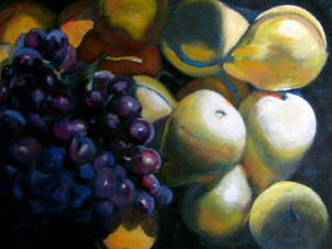
You will also find some flavours in my painting below; as usual, the blacks are built from many layers of transparent pigments, but they do vary substantially. So now you have some homework. Go to www.google.com/culturalinstitute/project/art-project and mosey through it, looking for paintings with black backgrounds. Choose one and expand it until you can see the brushstrokes. What read at first as black will reveal itself to be a varying mixture and one, moreover, which will have a definite “flavour.” Enjoy!
Small admission: yes, I still have trouble finding exact matches in my closet. But it all else fails at least now I can mix the colours I want and dress a self portrait in sartorial splendor! For that matter, I guess I could be taller too....
Sidenote: I love the name of Swarthmore College because it reminds me of an old friend who took delight in telling people that she did her undergraduate work at "Black black."


 RSS Feed
