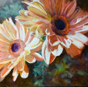
 "Upturned Faces" oil 16 x 16
 It’s mid-summer and already the ecstatic blooming is beginning to slow. Only the hardiest and most drought-tolerant thrive now. Water-hauling is the order of the day in domestic gardens (which obediently reward us with predictable beauty), but it was wild nature that made me re-think colour theory this week. I was confronted with a breath-taking hillside of intermixed orange day-lilies and deep pink pea flowers. Core belief: there is no such thing as a bad colour if it chooses its friends carefully. Thanks to yesterday’s epiphany I now have to drop the “if” clause. I would never have planted pink and orange flowers side by side but that hillside proved me wrong. It sent me back to my digital record of paintings and the only one so far that gives me any credit at all for a colour brain is this one. It was in fact that same colour combination that had initially made me choose it. Thought for today while the portrait's most recent glaze is drying: might the portrait benefit from the same fresh colours! *
In search of even more strong colour, we took to the river a few days ago - Jon to scout for the subtle speckling of a trout and I to seek deep zenith blue reflected on water. Neither of us was disappointed. Several of my shots might even be worth translating onto the canvas. There were cobalts to be found, not only in the dome of sky but also in the patches of vervain which populated the river so, like a drunk at an open bar, I took a hundred digitals over the two-hour paddle. The shot I regret missing was that of a green heron. Even lovelier than great blues herons, if you are lucky you mightcatch sight these small neat fishers making short flights along the shore line before disappearing into the rushes. Only their bright orange legs quibble with the overall elegance of the green heron.
So how to mix a clear hot orange? Let's start with what not to do. Don’t mix a yellow that leans blue (lemon yellow, for example) with a red that leans blue (alizarin or magenta, say) in any medium if you want a clean colour. With all three primaries present, even if your two pigments are transparent, you will still end up with a duckegg tone. Here’s what you do instead: combine a warm (i.e. leaning red) transparent yellow such as stil de grain with a warm (leaning yellow) transparent red such as vermilion. Remember: warm with warm or cool with cool when mixing transparent primaries. Then sit back and remember high summer.
* The portrait is actually coming along fine but I am still in the afterglow of orange and pink.
 RSS Feed
