The Art of Nature and the Nature of Art
  • Musings on Life and Work in Progress
  • Find my gallery
  • Contact Me Directly

Black black

30/5/2016

0 Comments


Until I started to paint, I never gave much thought to how colours were created.  Of course I had my favourites, but I kept running into trouble whenever I tried to put together an wardrobe, if my closet could be dignified with the name.  Inevitably, those two "turquoise" items didn’t match let alone play nicely together, and reds were even worse.  Sometimes I could get away with it by choosing a plaid or a tweed but I doubt that I was the only person lost with no hope of exact colour coordination.  

It wasn't until I began to paint that the penny dropped:  there were simply endless possibilities of colour mixing.  Perhaps the biggest surprise was black.  I had been taught that it was the combination of all colours, but then so was brown.  When I began painting in oil it became clearer that black lacks white, while brown invites it, even if it's just a bit.  But black, the "darkest dark," has an ace in the hole:  its tremendous value when set next to the "lightest light" to highlight a focal point.  Easy peezy.  Black's a star.

But not so fast!  Nobody  I know simply buys a tube of black and uses it indiscriminately.  For one thing,  even there lurk dragons — did you want “lamp” black, “ivory” black, “mars” black or “perylene” black?  Each has a specific use.  More importantly, simply applying black out of the tube is a recipe for fatal boredom.  The best paintings contain dancing moody blacks.  What that means is that while the three transparent primaries certainly can produce a perfectly balanced telephone black, it’s much more interesting to tweak the mix so that one or two of them dominate in a way that complements the surrounding elements.  

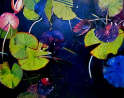
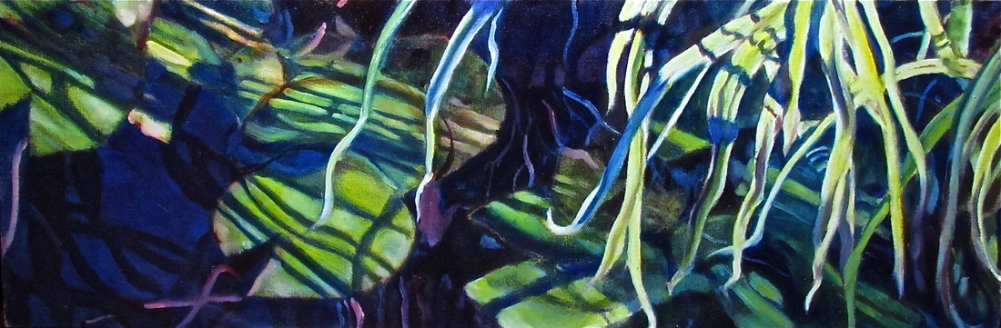
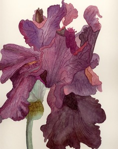
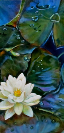
This is what’s known as “chromatic black.”  For example, I have a weakness for dark backgrounds in botanical painting;  they pop the main attraction forward because most flowers are on the bright side. But I am slowly learning to toggle the chroma accordingly.  Daffodils now ask me for a purple-black to nestle in, red roses like a green-black, while marigolds positively sashay though blue-black.  At times I will mix an ultramarine blue with burnt sienna for warm dark; using phlalo blue and burnt umber produces a cooler dark.  There are as many recipes for deep darks as there are good cooks.

The painter John Anderson uses the term “flavour” to describe his chromatic approach to painting.  You will never find a pure white in a work of his; that bright section might have a tinge of blue or cream. And even in a night scene, his darkest darks, probably tree trunks,  may turn out to be purple, although they will read as black to the casual viewer.  

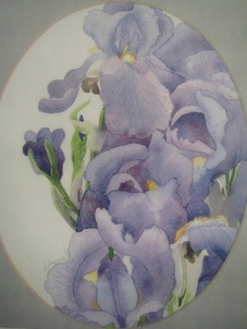
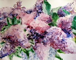
You will also find some flavours in my painting below;  as usual, the blacks are built from many layers of transparent pigments, but they do vary substantially.  So now you have some homework.  Go to www.google.com/culturalinstitute/project/art-project    and mosey through it, looking for paintings with black backgrounds.  Choose one and expand it until you can see the brushstrokes.  What read at first as black will reveal itself to be a varying mixture and one, moreover, which will have a definite “flavour.”  Enjoy! 

Small admission:  yes, I still have trouble finding exact matches in my closet. But it all else fails at least now I can mix the colours I want and dress a self portrait in sartorial splendor!  For that matter, I guess I could be taller too....

Sidenote:   I love the name of Swarthmore College because it reminds me of an old friend who took delight in telling people that she did her undergraduate work at "Black black."
Picture
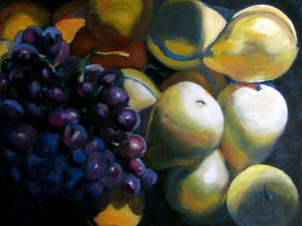
"Pears and Grapes" glaze oil 12x16
0 Comments

That Time of the Year

3/9/2015

 
Picture"Miss Beef" glaze oil 8 x 8
I bought a half-bushel of roma tomatoes today in a fit of optimism.  Ask me if I can can (not the dance)  or make tomato sauce.  No.  Let me think about that...   Still no.  And there they sit, sullen on the kitchen floor, guessing their fate.  I just couldn't help myself.  It's that time of the year.

Just as I buy pears to paint around Christmas, I buy tomatoes in September.  They are just too gorgeous to ignore, winking at me from their glossy piles at the grocery.  I so love ripe tomatoes that  I even painted myself a big fat fall tomato which hangs in our kitchen year round to remind me of what tomatoes should look like.  I was a spoiled child.  My dad grew huge beefsteak tomatoes, harnessing the light and heat reflected off the house's white stucco.  We ate tomato sandwiches almost every day. This cadmium red bounty lasted well into November because my parents harvested all of the green tomatoes before the first frost and carefully wrapped them in newspaper, where they obligingly ripened.  At the time I thought this was quaint; now I realize it was smart.  The pink plastic tomatoes of winter have humbled me.

So I shall settle today's beauties into a pretty blue bowl and take lots of pictures.  I may even tart them up with a few equally gorgeous eggplants.  Did I mention that I bought half-bushels of them, as well as of red peppers?  It was only as I began to rehearse ratatouille recipes in my head that the penny dropped:  all three are fruits of the solanaceae family or nightshades.  This matters only because they have been associated with arthritis, something I have only in September.  Funny, that.

Should you decide nonetheless to risk immortalizing and then eating a tomato, there is one other health consideration:  cadmium is a heavy metal.  One of the many things I owe to Kathy Bailey is a safer palette.  Her red is alizarin crimson, considered by ASTM to be harmless, although I think it's fair to assume that they don't expect you to eat it.  If combined with a touch of transparent yellow and glazed over white, a highly serviceable tomato red can be created.   

However you use them, do enjoy your tomatoes;  it's definitely that time of the year.

Hot Raspberry

26/7/2015

 
Picture
We were hiking on a country road this week and found ourselves between banks of ripe raspberries on either side. Free sun-warmed raspberries always taste the best and we did them justice.    Although fresh raspberries rarely make it into a bowl, I do insist on keeping a dedicated bramble patch in our own garden too.  The dry heat has finished most of the raspberries here but I dedicated time today to watering the blackberries;  they are heading up nicely and now need only to fill out.  Surely heaven reserves a special place for the genius who developed the thornless variety.  Sadly they only ripen when summer is winding down so their flavour contains a tinge of farewell.

Raspberry is equally appealing as a colour.  I mix it from alizarin crimson with a touch of ultramarine blue and a hint of white.  It always feels sensuous, special, hot.  Watercolour has a higher key version called "Opera," an inspired name if there ever was one;  it is a permanent colour, despite its reputation of being "fugitive."  Clothing in Schiaparelli (pronounced"skaparelly") pink also catches my eye.  Elsa Schiaparelli went so far as to stage a hunger strike to escape from the convent her desperate parents had sent her to ;  as a Parisian couturiere in the 30's she invented women's divided skirts (thank you) and teamed up with Salvador Dali (we forgive you).  The hot pink which bears her name remains a favourite of many, even if it appears only as a hot "pop" in a cooler setting.  

I was drawn to these waterlilies for that very reason.  While the deep pinks cover very little of the total area of the paintings, their placements play a major role in directing the eye of the viewer through the blues and greens.  

Now it's back to the garden while there is still enough light to see who ripened today!

Butterfly Shadows and Froggy Mud

2/6/2015

 
Picture"The Floating World" glaze oil 10 x 30
I saw her shadow before I could spot her, but there she was, moving purposefully over the garden like a seasoned shopper in a discount mall.  Finally the Eastern Swallowtail settled on the Russian olive, a puzzling choice given that it was not in bloom while the pagoda tree next to it was covered with flowers.  While I stood and watched, a Painted Lady settled down besides me to lap at a rhododendron.  Several dragonflies flew missions here and there, and a honeybee doused herself in pollen.  A purple finch and a gold finch shared the sunflower feeder.  

Haven't seen the toad today.  We have great hopes for his attaining great age and girth:  they can live to twenty, dignified and judicial.   We put old plates here and there, propped up by a small rock, for him to seek shade.  No garter snakes so far, although I can't imagine this old garden without one or two and trust that they are in there.  Pre: West Nile, we had small ponds where we unsuccessfully tried to raise goldfish and grow waterlilies.  The raccoons put paid to that effort, although they had no luck catching the elegant leopard frogs who showed up and moved in.  Because the ponds were too shallow for the frogs to overwinter, I formed an emergency plan.  In November, I dug them out of the mud where they were peacefully dormant and popped them into their new styrofoam sleeping chamber at the back of the fridge.    All went well until they realized that the temperatures were above freezing and liberated themselves.  Bit of a shock, that, when you're expecting to find milk, not half a dozen perky frogs.  Jon and I agreed that Plan B had to be executed.  Under cover of darkness we released them in a large deep pond nearby, where they gratefully dug in again, and probably founded a dynasty the next spring.

Butterfly shadows and froggy mud make me think of "ombre," which is French for "shadow."  One of my favourite lines from a novel was "The archbishop's wife was a pale penumbra of the archbishop." Shadows certainly get a bad rap in literature until you think about how the world actually looks when there is a high overcast.  All of the extremes of colour and value disappear and everything becomes bland.  For this darkening, "umber," whether burnt or raw has proven to be a crucial colour in landscape painting.  But apparently Umbria is running short of the original pigment and other sources have had to be found;  as a result the tubes you buy can vary wildly from one to the next.  Maybe I should be looking to grind my own. There's a pond nearby that just might work.

Purple Prose

3/4/2015

 
PictureWatercolour 11 x 14
A beloved sister gave me a beautiful dark plum scarf this year;  it was handcrafted on Salt Spring Island, a mecca for artists and artisans.  I treasure it not only because it reminds me of her but also because it is Jon's favourite colour.  How favourite?  Well, one year he took a team to the provincial finals and when, as a coach, he was given a choice of paraphenalia, he immediately chose the pretty women's jacket because it was purple.  And of course he wears it.  

It was the Phoenicians who first created a purple dye (from thousands of luckless sea snails); prized because it resisted fading, this purple actually brightened with exposure to light.  It was literally worth its weight in silver.  Its rarity and cost as a luxury trade item led the Romans to make Tyrian purple the imperial colour, and a child born to a reigning emperor was said to be "born in the purple.".  In 1204, the sack of Constantinople brought an end to its availability.  Snails everywhere celebrated. 

Now, of course, purple can be created in the lab, but still this secondary colour, created by mixing two primaries, blue and red, retains a certain cachet.  And like any mixture, it also gives rise to a range of shades. When the red dominates the blue, you get wine, a colour which I rarely choose, associating it with mens-wear autumn palettes and Tim Hortons' cups.  My preference is for the blue to dominate, producing violet.  When my father died, Jon and I chose to cover his coffin with mosses and blue violets because he had so loved nature, and for years I have kept African violets in the deepest blues as a reminder of him.    


The iris above was so dark purple as to be almost black in places.  I couldn't bear to cut it, so I sat in the garden and painted it, using the colours reflected in the dark petals to define different flower parts and to create dimensionality. Knowing no better, I scored the watercolour paper to create the venation.  

These irises below were so delicate as to be almost transparent.  That is why they look mauve, which is simply purple with the addition of white.  In watercolour, of course, it is not possible to mix with white, so I painted them with a thin wash of alizarin and ultramarine, both transparent pigments, and let the paper shine through.

Picture
"Next to the bridge" watercolour 11 x 14

The Virtues of White China

6/3/2015

 
Picture"Lilac" watercolour on yupo paper, 20 x 32
Because I have been rifling through cupboards looking for objets to set up in a still life tableau, I am finding some old treasures.  Years ago (remember the missing flatware?) I stopped using the Wedgewood that my mother helped me select at Birks.  My taste ran then to ornate, but Mom was a mid-century teak collector who prized simplicity of line above all.  She convinced me to choose the pattern "California;" which is perfectly white with a gold band.  Her winning argument was the insight that all food looks terrific against white.  I was struck by her point and chose the pattern she recommended.

As a break from painting yesterday, I carefully washed the California and the beautiful old Limoges which were also white and gold, though with scalloped edges and tiny fleurs de lys, which my dear Aunt Hazel had given me.  The porcelain Limoges is far more delicate than the English bone china, something my aunt realized when she as a newly-wed had received it as a gift from her rather challenging mother-in-law, who had shipped it from south-west U.S. in a crate without any padding.  Aunt Hazel's gift to me was comprised of the few miraculous survivors of that hellish trip.  I treasure them and rather admire their will to live.

Of course, Mother was absolutely right.  Everything except beige food looks great on those plates.  In general, white enhances the juiciness of other colours and I used it shamelessly as a background in my watercolours.  In fact, until I took up oils, I didn't even own any white paint because the trick in watercolour is always to reserve the white of the paper, an intention more honoured in the breach than in the observance.

Oil is the diametric opposite and pure white as a super highlight is the very last addition to a painting. Generally, however, the best way to judge the colour you are mixing is to place it on a mid-tone background.  For years I have toned new canvases in Indian red or raw umber but it never occurred to me to use a mid-tone palette as well.  Elizabeth Robbins had an elegantly simple solution:  an old watercolour frame, fitted with cardboard backing under the glass.  Heading for my go-to second-hand store, I bought one immediately.  If the paint dries on me, a few swipes with a razer scraper clears the $1 palette admirably. Thanks, Elizabeth!

I often wonder how I would manage without the presence of the wise women in my life.

Seeing the world through coloured glasses

9/11/2014

 
The season of intense colours is coming to an end and you too might have been taking pictures.  For some years I remember feeling puzzled by the results.  The trees invariably seemed drabber and less gloriously bright than I had remembered them.

It took a combination of experience with digital photography and glaze oil technique to figure it out.  The first helpful hint was Kathy Bailey's cautioning me that digital saps red, often rendering it as pink, and so I learned to tweak the red setting.  But I only recently realized what else was misleading me:  I always wear brown sunglasses out of doors.  

Now brown is not so much a colour as a combination of primaries.  We were told in grade school that you could create it by mixing red and green.  It would have been more helpful to have said "red and blue and yellow."  In fact I often apply a transparent brown glaze over sections of a painting not only to unify it but also to enrich the tones.  I suspect that is what happens when we choose to "enhance" a photo.  Alternatively I can simply remember the scene that caught my eye and manually adjust the digital image to recapture it.  I'm always on the hunt for juicey colour.

So, counter-intuitively, it turns out that I am one for whom our colourful world has been most happily viewed through brown-coloured glasses.  (Speaking of which, my bifocals have surfaced but the red high heel is still AWOL.  Any sightings?  I suspect that little devil may be out on the town somewhere!)
Picture
"Misty Morning on The Rocky" Diptych panel #2 30 x 30 glaze oil

Chasing Perfection

13/8/2014

0 Comments

 
Picture"The Floating World" # 12 x 24 oil
This time of the year, the waterlilies are in bloom.  The lotus flower is spectacular, to begin with.  They are harder to paint than I would have predicted because they, like clouds, appear at first glance to be all white;  closer examination reveals that the petals are defined by the colours they reflect and their tiny imperfections where some insect has taken a bite;  their centres stand as stiffly as soldiers and glow with a yellow that painters will identify as cadmium yellow deep.

The leaves, however, are even better!  They reflect the sky and the flowers;  these ones begged for the laying in of Prussian blue glazes.  And they forced me to learn how to paint water droplets.  My father bought a print when I was a child;  the artist had painted a rose with a perfect droplet beside it and Dad endlessly admired  that detail. As a result, I felt daunted at the prospect of trying one.  It turns out that a drop of water has two predictable characteristics:  it casts a shadow, and it always has a spot or two of reflected light, as your pupil does.  And while a droplet tends to be rounded or globular, its shape is ultimately determined by its circumstance, as in the case of the upside-down heart in the upper right.  

I remember trying to bring waterlilies home, always failing and feeling like an assassin.  This is much better.   

0 Comments
    Picture

    Archive

    July 2023
    April 2023
    March 2023
    February 2023
    January 2023
    December 2022
    November 2022
    October 2022
    September 2022
    August 2022
    July 2022
    June 2022
    May 2022
    March 2022
    February 2022
    January 2022
    October 2021
    July 2021
    March 2021
    January 2021
    December 2020
    November 2020
    October 2020
    October 2019
    September 2019
    August 2019
    July 2019
    June 2019
    May 2019
    April 2019
    March 2019
    February 2019
    January 2019
    December 2018
    November 2018
    October 2018
    September 2018
    August 2018
    July 2018
    June 2018
    May 2018
    April 2018
    March 2018
    February 2018
    January 2018
    December 2017
    November 2017
    October 2017
    September 2017
    August 2017
    July 2017
    June 2017
    May 2017
    April 2017
    March 2017
    February 2017
    January 2017
    December 2016
    November 2016
    October 2016
    September 2016
    August 2016
    July 2016
    June 2016
    May 2016
    April 2016
    March 2016
    February 2016
    January 2016
    December 2015
    November 2015
    October 2015
    September 2015
    August 2015
    July 2015
    June 2015
    May 2015
    April 2015
    March 2015
    February 2015
    January 2015
    December 2014
    November 2014
    October 2014
    September 2014
    August 2014
    July 2014
    June 2014
    May 2014
    April 2014
    March 2014

    Categories

    All
    ALLA PRIMA PAINTING
    ANIMALS
    ART SHOWS
    BOOK RECOMMENDATIONS
    CHRISTMAS
    COLOUR THEORY
    COMPOSITION
    GARDENING
    GLAZE OIL PAINTING
    HOW SHAPE MATTERS
    INSPIRATION
    OUTDOOR LIFE
    PALETTE
    PHOTOGRAPIC REFS
    PORTRAITS OF CHILDREN
    PORTRAITURE
    SEASONS
    STILL LIFE
    SUBJECT MATTER
    THE FUNCTION OF TITLES
    THE HUMAN COMEDY
    THE ISSUE OF SIZE
    THIS OLD HOUSE
    TREES
    UNDERPAINTING
    YouTubes

    RSS Feed

Powered by Create your own unique website with customizable templates.