Poor language - so often misaligned, even twisted out of recognition. Take the word “shade”: it must have been miffed to find its root employed to describe a criminal or, worse, a sexual deviant. “Shade” is in fact a delightful word, deserving only of positive connotations. It was even ahead of its time. Let me explain.
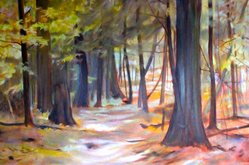
To begin with, no one but a masochist who is planning a short life finds a beach and self-broils. Once you realize that solar radiation does not peel off and simply accumulates over a lifetime, it’s either dips in a vat of SPF 30 or long sleeves, sunglasses and a good hat unless you have the good sense to seek out shade. Cool, restful shade, best cast by trees.
Having blue, light-sensitive eyes, I am naturally inclined to do just that. The older and taller the trees, the better. I even want to see them from every room in our house. (Thus, wind storms make me as nervous as a cat in a room full of rocking chairs.). Most of the time, though, it is not only comfortable around these wise old plants, but comforting.
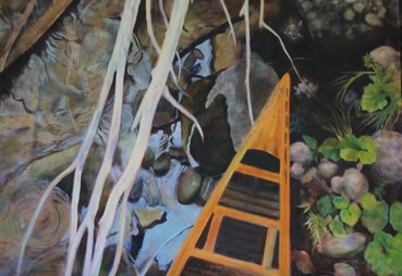
As one who doesn’t like to be in bright sunshine, it might seen counter-intuitive to love it (while happily under a tree); again, give the credit to shadows. While overcast days flatten the landscape and sap colour, a sunny day fills the world, including shade, with colour. When you stop to think about it, while sun lights up our visual field and floods it with colour, it is shadows which give the world three dimensions. If you have ever been instructed to draw or paint a globe, it becomes immediately necessary to darken certain areas by identifying “core shadows.” Fail to do this and all you have is a circle. Darks and lights help us understand the world.
It gets better. Artists make a distinction between different types of shadows. That three-dimensional object will itself cast a shadow. Such “cast shadows” are a joy to paint because they will contain both the colours of the object and what’s lying under the shadow. For that matter, the core shadows will be subtle and rich as well. Perhaps that is the inspiration for the word "shade" as it refers to colour variations.
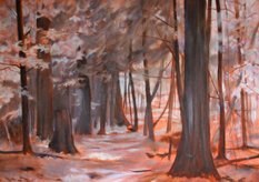
Now think of your garden as a collection of of core and cast shadows. Visualize a shady garden in late spring when the canopy has opened and light peeks through, creating a kingdom of greens to reign throughout. No need for sun shelters because the trees capture most of the light and grab the solar radiation for themselves. It’s my vision of heaven.
But wait! Something’s in short supply. Yup, it’s flowers. This point was hammered home this week when I was gazing out the bedroom window and saw flowers forming on the magnolia we planted in 1997. What? It hasn't bloomed since 1998. And then I remembered that that big Manitoba maple that uprooted itself during a windstorm had been removed and that there was actually some sun back there this year. Now we have a new concept, one which Jon and I were slow to learn, let alone observe: “shade-tolerance.” I still feel guilty about the white pine seedling which we carefully planted just into the ravine. It unfortunately needed full sun and we had doomed the poor thing to cling to life for a decade before succumbing to energy starvation. And that magnolia would have also failed that “Are you shade-tolerant?” quiz, but we were too stupid to ask.
So since we moved here almost forty years ago, we have been painfully learning what plants/trees are shade-tolerant. It breaks my heart that tomatoes are most definitely not. But in the same way that I love forests for their green bounty and variety of dainty flowers, I have sought out and developed a repertoire of plants which are grateful for shade in my garden. My spring favourite is viola. At first, the genus will be represented by pots of pansies, but scores of shy wild blue violets will soon stud the forest in the back garden. I've been meaning to paint these lovely faces for years.
Here goes.
To begin with, no one but a masochist who is planning a short life finds a beach and self-broils. Once you realize that solar radiation does not peel off and simply accumulates over a lifetime, it’s either dips in a vat of SPF 30 or long sleeves, sunglasses and a good hat unless you have the good sense to seek out shade. Cool, restful shade, best cast by trees.
Having blue, light-sensitive eyes, I am naturally inclined to do just that. The older and taller the trees, the better. I even want to see them from every room in our house. (Thus, wind storms make me as nervous as a cat in a room full of rocking chairs.). Most of the time, though, it is not only comfortable around these wise old plants, but comforting.
As one who doesn’t like to be in bright sunshine, it might seen counter-intuitive to love it (while happily under a tree); again, give the credit to shadows. While overcast days flatten the landscape and sap colour, a sunny day fills the world, including shade, with colour. When you stop to think about it, while sun lights up our visual field and floods it with colour, it is shadows which give the world three dimensions. If you have ever been instructed to draw or paint a globe, it becomes immediately necessary to darken certain areas by identifying “core shadows.” Fail to do this and all you have is a circle. Darks and lights help us understand the world.
It gets better. Artists make a distinction between different types of shadows. That three-dimensional object will itself cast a shadow. Such “cast shadows” are a joy to paint because they will contain both the colours of the object and what’s lying under the shadow. For that matter, the core shadows will be subtle and rich as well. Perhaps that is the inspiration for the word "shade" as it refers to colour variations.
Now think of your garden as a collection of of core and cast shadows. Visualize a shady garden in late spring when the canopy has opened and light peeks through, creating a kingdom of greens to reign throughout. No need for sun shelters because the trees capture most of the light and grab the solar radiation for themselves. It’s my vision of heaven.
But wait! Something’s in short supply. Yup, it’s flowers. This point was hammered home this week when I was gazing out the bedroom window and saw flowers forming on the magnolia we planted in 1997. What? It hasn't bloomed since 1998. And then I remembered that that big Manitoba maple that uprooted itself during a windstorm had been removed and that there was actually some sun back there this year. Now we have a new concept, one which Jon and I were slow to learn, let alone observe: “shade-tolerance.” I still feel guilty about the white pine seedling which we carefully planted just into the ravine. It unfortunately needed full sun and we had doomed the poor thing to cling to life for a decade before succumbing to energy starvation. And that magnolia would have also failed that “Are you shade-tolerant?” quiz, but we were too stupid to ask.
So since we moved here almost forty years ago, we have been painfully learning what plants/trees are shade-tolerant. It breaks my heart that tomatoes are most definitely not. But in the same way that I love forests for their green bounty and variety of dainty flowers, I have sought out and developed a repertoire of plants which are grateful for shade in my garden. My spring favourite is viola. At first, the genus will be represented by pots of pansies, but scores of shy wild blue violets will soon stud the forest in the back garden. I've been meaning to paint these lovely faces for years.
Here goes.

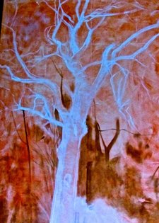
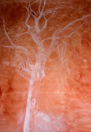
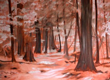
grisaille 10 x 20


 RSS Feed
