The Art of Nature and the Nature of Art
  • Musings on Life and Work in Progress
  • Find my gallery
  • Contact Me Directly

Block Party

22/3/2018

0 Comments

 
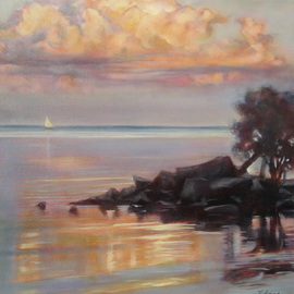
This week’s inspiration was born on a ferry dock in late October.  As I waited to leave Salt Spring Island and head to the air terminal in Sydney, dawn broke and night melted into a soft sky-blue pink, which itself dissolved before my hungry eyes.   Though not quite foggy, the softness of the scene brought Carl Sandburg's famous poem to mind:

The fog comes 
on little cat feet. 

It sits looking 
over harbor and city 
on silent haunches 

and then moves on.
 

Firing off a hundred shots like a crazed paparazzo, I sailed on, as rich as Croesus.  It’s the same feeling I get when staggering out of a public library, arms laden with books.  Always the cheap date....

I’ve been thinking  longingly about these digitals since then.  Finally, there was enough clear floor space this week to gesso some canvases because my soul is begging for colour.  This time of the year is the only season that stubbornly refuses to provide much in the way of beauty. In fact, yesterday in the park may as well have been a white-flagged surrender to drabness, so painting was a must. That Salt Spring glow of dawn beckoned, demanding a long horizontal  (36 x 24) format.

My intent is to develop the painting through colour blocking.  Pam Carter, the Scottish landscape artist who regularly paints this way, earns my admiration for her juicy blocks of colour.   It is misleading to assume that there is no sophistication in this style — Carter’s expanses are full of subtlety and masterful blending — so I too am looking to set up masses of what is apparently a single colour, but which are full of mixed colours and quiet transitions.  While Carter uses a high-key palette as I often do, this painting will be closer to the pastel register.  Time for stronger colour once my eyes adjust to spring.

In her exquisite novel, The Winter Vault,  Anne Michaels describes an ancient Nubian village about to be lost forever to the Aswan Dam construction, a human tragedy compounded by an aesthetic one.  Here is Michaels' gorgeous word-painting, which I visualize as colour blocking:

The houses were like gardens sprung up in the sand after a rainfall.  As if cut by Matisse’s scissors, shapes of pure colour - intense and separate - were painted onto the glowing white walls.  Designs of cinnamon, rust, phthalocyanine free, rose antwerp blue, tan, cream, madder, lamp black,sienna,and ancient yellow ochre,perhaps the oldest pigment used by man.  Each a shout of joy.  Embedded in the whitewashed walls were decoration - designs of brightly coloured lime wash, bright as the eye could bear - geometric patterns, plants, birds and animals - with mosaics set into the plaster like jewels, and snail shells, and polished pebbles.  Over the gates were elaborately painted china plates, as many as thirty or forty decorating a single house.  They were like stones of a necklace set against the white skin - porous, breathing, cool - of the plaster.  Here was human love of place so freely expressed, alive with meaning;  houses so perfectly adapted  to their context in materials and design that they could never be moved.  It was an integrity of art, domestic life, landscape…. (131-2)

If my new painting has a theme so full of love, it has something to do with the hope that each dawn brings, a hope  bolstered by the survival of such a paradise --  a theme that must, however, be delivered wordlessly. 

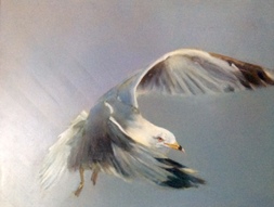
All I've done so far is to establish the blocks of colour— once this dries I will do some glazing but thinly so as suggest rather than emphasize the mood.  No hard edges.  I also have a crow and a buoy or two to place in focal points.  Playing around with titles, I think today’s best candidate is “Little Cat Feet.”   Lots to do. 

(Another small hope - that it will be dry in time for the show!)
Picture
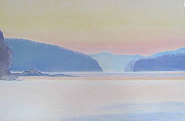
Little Cat Feet 36 x 24 oil
0 Comments

Spring's My Season

8/5/2017

0 Comments

 
Picture
​Yes, we have a frost advisory tonight so I hauled in the red geraniums and wrapped the white begonias in a scarf, but otherwise it is spring.  I know this for sure because everything is in motion.

In general, the usuals are doing the usual things.  At least one chipmunk survived the winter and last summer’s predators, thank heavens, and scoots past our feet as we garden.  The garlic mustard, while almost eradicated in our own garden, thrives elsewhere, growing inches each day — It was discouraging to hike Mount Nemo this week and notice that its splendid masses of ephemerals are under siege.  I pulled the biggest plants but this is not a battle which can be won.  Woodpeckers everywhere hammer away,  dazed by  the bonanza of dead ash trees.  And then there’s the grouse, of course.  We’ve concluded that he is mildly insane, but in a nice way.

For me the excitement is in the return, if only briefly, of migrants.  Jon saw a wild turkey a couple of doors down and the next night our neighbours called to ask about the enormous birds roosting in their tree — the huge lumps turned out to be turkey vultures.  They soar above the valley but this is the first time I’ve seen them resting.  Warblers appear and move on, edgy geese couples take turns brooding and guarding, and the steelhead run straggles on.  

What brought all of this motion to my attention was a moment in an art gallery yesterday.  I was admiring a Maurice Cullen when Jon said “Remember how I always tell you to add an animal to your paintings?”  (He relentlessly teases me that there’s nothing wrong with a painting that can’t be fixed by the addition of a bunny.  Or a fish.  Or an eagle.  You get the picture.)  Anyway, I turned to look at the painting he was talking about and instantly caught the joke.  The scene was beautifully painted with blue-capped snowbanks reminiscent of Lauren Harris, and perfectly capable of standing on its own.   But at the focal point was an unfortunate stag, frozen in  mid-jump like a wooden carousel horse.   Jon christened it “Boing!!”

Not that I would do any better.  Not a chance.  While everything, particularly in the spring, is in motion, it is motion itself which is the hardest thing to capture.  A still life subject has the virtue of staying put.  (When I was teaching myself to paint, I began with single flowers on a white background;  all alternatives were too overwhelming.)  I wish I could report that I have since mastered motion but nope.    Some of my paintings avoid sharp edges to give the impression of blurred speed but often the best I can do is to guide the viewer’s eye to move through the painting. 

Whatever the device,  spring paintings need an edge of chaos. This small watercolour reflects my panic as I watched Jon and Brian surf a standing wave. Maybe spring's my season.  I scare easy.  


0 Comments

Backwards and  in High Heels

25/4/2017

0 Comments

 
The whole idea of reversals interests me;  it worked for Ginger Rogers, after all.  So yesterday, when faced by an enormous 12 square foot white canvas, I decided to work the image upside-down.  Six hours later I had a grisaille in which wild Newfoundland hangs suspended above a cloudless sky.  It remains to be seen whether tricking my left brain into vacating the field a la Betty Edwards will propel my painting but it is at least forcing me to think in abstract shapes.

Whatever the orientation,  I am frequently inspired by the Newfoundland aerial view.  The greens are lovely and dark.  Often there are low blue mountains in the distance and here and there are patches of brightness - whether bodies of water or farmed areas.  But these vast scenes demand space of their own.  Thus I find myself once again teetering on a step stool in order to reach the top.

So doing, I am reminded why I spent most of the winter doing small botanicals and bird studies!  Large paintings do generate impact and are exciting to build, layer by layer taking form in front of me like a statue emerging from a block of marble, but they are physically demanding and enormously time-consuming.    By way of contrast there is something immediate and refreshing about small pieces.  In the space of a day they take form and reward me for my effort so Wednesdays at group paint days I have gotten into the habit of working small.  There’s nothing much nicer than painting away in a room full of happy artists, tiddly pom.

But the die has been cast.  Today — engaged, apprehensive  — I am peering up at a huge upside-down landscape.   The game’s afoot!  Watch your toes, Fred.
Picture
"Up, Up" 2015 36 x 48 glaze oil
0 Comments

Even as

17/4/2017

0 Comments

 
Picture"Above the Credit" 24 x 36 glaze oil
Easter Sunday was windy but with patches of brilliant sunshine.    Everywhere life was reaffirming itself.  Heading over to the college in the afternoon, we trekked up to the woods, hoping to see birds before the canopy opened.  

The best we did was to establish that they were there.  The “Honey, I’m Home” quonks of a red-bellied woodpeckers* were audible, as they have been around the river and in our front yard and we could hear canaries, nuthatches and chickadees.  But the loud hammering had to belong to a pileated and Jon did  finally spot him.  We had brought the long lens and Jon patiently manoeuvred around twigs to find clear shots.  

Equally patient, Theodore and I waited on the main path.  Usually we all walk north and return another way. but yesterday I happened to glance back just as the Easter sun emerged from behind a cloud, and there it was!  I had tried many times to find that scene again but yesterday I was reminded why I had originally taken the shot:  a shaft of sunshine was strewing shadows across the path and highlighting the mossy exposed roots  which comprise the focal point.  I had been starting to wonder if I had made it up but once more the real deal took my breath away and proved that it's hard to improve on the truth.   

Finding the exact spot was like running into an old friend —the same attendant sense of strong recognition. Theodore had no reaction whatsoever.  He was still smarting from the indignity of being forbidden to keep a prize short rib his sniffer had located in the parkland, and there was a bur or two to be chewed out.  I have always thought that shared moments are the best.  But yesterday reminded me that while my primary sense is vision, Theodore’s magnificent schnoz is for him the bearer of most good things and that it is enough to celebrate beauty in whatever form it takes.  Sometimes it will smell like a short rib.  
   
​* see 19/5/16

0 Comments

A Modest Proposal

6/3/2017

0 Comments

 
I’ve been meaning to write about this sensitive issue for a very long time, each time hesitating for fear of causing regret.  But I keep finding myself painting memorials to a beloved - a person, a pet - while having to work with a posed or poor quality image because there was no other choice.  Often the image even fails to capture the telling expression, but it is all there is to work from.

Painting a portrait is by necessity slow and careful.  The tolerances for error are exceedingly small if you are aiming for immediate recognition and I do.  That said, simply getting the contours, proportions and skin tones right is not enough in my opinion.  Our dear ones have mobile features and a vast array of expressions, some of them highly characteristic.  

My modest proposal is rather easier and a heck of a lot more benign that Jonathan Swift's was: USE YOUR CAMERA REGULARLY.  Given the high quality of smartphone cameras, virtually everybody has near-constant access to good photography.  Use these amazing tools to take lots of close-ups of your beloveds.  Group shots are fun but do not take the place of portraiture.  It doesn’t matter in the slightest if you plan to have the photo turned into a portrait.  What matters is that someone who really matters is documented  generously.  These crystallized moments will have great meaning in the future.  Just remember to regularly download them  onto a HD or a DVD which you store somewhere safe off-site.  

And what to do if someone you care about seizes up at the sight of a camera?  When I wanted to paint a friend whose deer-in-the-headlight expression around cameras bore no relationship to her exuberant personality, I enlisted Jon the Relentless Tease to distract her.  Despite herself,  she eventually exploded in laughter and SNAP! 


Picture
0 Comments

When That Lily Does Need a Bit of Gilt

12/11/2016

0 Comments

 
While my digital for “The Floating World” 6 may not have needed gilding, I hope I was clear in the last post that the vast majority of images could do with polish whether a little or a lot.  Several of my favourite paintings came from really dodgy reference shots.  In some cases the original image was so terrible that I seem to have have expunged it from my photo library.  You know I have kept over 20,000 jpegs:  that would give you some idea of how little there was to work with in those missing in action.  

However, here’s an example for which I do have the original reference:  a portrait within the “Reading the River” series.  The original shot was taken outside a nondescript cement block building and, while it had promise, needed some radical surgery first.  I sat on it for over a year, mulling over the problem (wrong shirt, hopeless background);  on the other hand, it had the makings of a good portrait with the added plus of superb gear.  I am frequently reminded by the resident fly fisher that gear trumps all else;  while I remain skeptical of that world view, I will acknowledge its truth in this particular photo.

The  solution when it finally arrived involved severe cropping.  I finally realized that the heart of the portrait was a skinny vertical.  Next to go was the plaid shirt, which distracted the focal points of his eyes, his hand, and (you guessed it)  the gear.  What mattered was the play of light throughout.  And then it worked.  Yippees all around.
Picture
Picture
Reading the River No. II "Donald Hambleton" glaze oil on canvas 10 x 30 Second Prize, Visual Arts Mississauga
0 Comments

Running over a Butterfly with an SUV  

3/10/2016

0 Comments

 
Picture
Ann Patchett’s novel Bel Canto is rich with music, passion and suspense. Critics loved it too, so I was astonished recently to read Patchett’s description of the creative process. With a few substitutions, this passage could be talking about any artist who tries to convey a transcendent experience:

When I can’t think of another stall, when putting it off has actually become more painful than doing it, I reach up and pluck the butterfly from the air. I take it from the region of my head and I press it down against my desk (easel), and there, with my own hand, I kill it. It’s not that I want to kill it, but it’s the only way I can get something that is so three-dimensional onto the flat page (canvas). Just to make sure the job is done I stick it into place with a pin. Imagine running over a butterfly with an SUV. Everything that was beautiful about this living thing — all the color, the light and movement — is gone. What I’m left with is the dry husk of my friend, the broken body chipped, dismantled, and poorly reassembled. Dead. That’s my book (painting).

Coincidentally, I had chosen the same metaphor last week when explaining to a friend that some images so inhabit my brain that I am compelled to snatch them out of the air in order to share them. I have come to understand that the glorious primary experience of that butterfly - the striking face, that moment in the woods, that glowing still life of apples on the counter — is simply ineffable. Its beauty is artless. The best an artist can do is to convey some small but true aspect of that loveliness. In this painting of poppies, the butterfly being grabbed out of the air was the deep vibrancy of the flowers set against the swirling grey-greens of the foliage.

Once a painting is finished, it is no longer mine; its ownership has transferred to anyone who completes the transaction by simply loving it too.


0 Comments

Once in a While

11/8/2016

0 Comments

 
    • Until I started to paint, I never gave much thought to how colours were created.  Of course I had my favourites, but I kept running into trouble whenever I tried to put together an wardrobe, if my closet could be dignified with the name.  Inevitably, those two turquoise items didn’t match or even cooperate, and reds were impossible. Sometimes I could get away with it by choosing a plaid or a tweed but I doubt that I was the only person lost with no hope of exact colour coordination.  


      It wasn't until I began to paint that the penny dropped:  there are simply endless possibilities of colour mixing.  Perhaps the biggest surprise was black.  I had been taught that it was the combination of all colours, but then so was brown.  When I began painting in oil it became clearer that black lacks white, while brown invites it, even if it's just a bit.  And black, the "darkest dark," is of tremendous value when set next to the "lightest light,"  as an infallible tool for highlighting a focal point.


      But not so fast!  Nobody  I know simply buys a tube of black and uses it indiscriminately.  For one thing,  even there lurk dragons — did you want “lamp” black, “ivory” black, “mars” black or “perylene” black?  Each has a specific use.  More importantly, simply applying black out of the tube is a recipe for flat boredom.  The best paintings contain dancing moody blacks.  What that means is that while the three primaries certainly can produce a perfectly balanced black, it’s much more interesting to tweak the mix so that one or two of them dominate in a way that complements the surrounding elements.  


      This is what’s known as “chromatic black.”  For example, I have a weakness for dark backgrounds in botanical painting;  they pop the main attraction forward because most flowers are on the bright side. But I toggle the chroma accordingly.  Daffodils ask me for a purple-black to nestle in, red roses like a green-black, while marigolds positively sashay though blue-black.  At times I will mix an ultramarine blue with burnt sienna for warm dark; using phlalo blue and burnt umber produces a cooler dark.  There are as many recipes for deep darks as there are good cooks.


      The painter John Anderson uses the term “flavour” to describe his chromatic approach to painting.  You will never find a pure white in a work of his; that bright section might have a tinge of blue or cream. And even in a night scene, his darkest darks, probably tree trunks,  may turn out to be purple, although they will read as black.  


      So now you have some homework.  Go to www.google.com/culturalinstitute/project/art-project    and mosey through it, looking for paintings with black backgrounds.  Choose one and expand it until you can see the brushstrokes.  What read as black will reveal itself to be a varying mixture and one, moreover, which will have a definite “flavour.”  Enjoy!


      But I still have trouble in the closet.  But self portraits can solve that problem.
    ​

0 CommentsNo comments posted
0 Comments

Ebony and Cobalt

25/5/2016

0 Comments

 
  Lately I’ve had the night scene bug.  Those of you who know that I avoid going out after dark might be surprised by this, but there you have it.  Some of my favourite painters capture that moment just after sunset, when there is still a glow at the horizon but little colour left elsewhere.  Naturally, I have tried to take such a picture but I’m too lazy to carry and set up a tripod and  our house does not address the west.  As a result, my “Night Scenes” iPhoto event has fewer than a dozen examples, half of which are blurred past any useful stage.  What to do?

I suppose that if I understood the basic principles of painting a night scene, I might be able to transform a scene, so I have been sitting here and looking at the masters, ancient and contemporary, of this art.  Who’s the best?

Well, Edward Hopper is unequalled at his graphic depictions of often solitary city people glimpsed through cafe windows late at night, probably during The Depression;  Hopper’s warm palette of clean primaries makes me happy, although often guiltily, given the stark loneliness he portrays.   Watch for his ledges, where the light spills out.  Two other Americans, Linden Frederick and John F. Carlson, accomplish the same objective by painting farmyards empty even of animals.  Their work is haunting in its simplicity.

The modern city, on the other hand, seems almost festive.  Hsin Yao Tseng, a precocious child of thirty, paints symphonies of lights, often reflected on wet pavement.  So too Jeremy Mann’s cities look intimate and beautiful, studded with the rubied tail lights;  he is an elderly 37.    Note to Self:  go downtown with a tripod.  Perhaps a camera too.  Find a teenager to run into traffic and set up.  Start thirty years ago.

My only blinding insight in addition is that they all paint the night sky in a significantly lower value than buildings and trees.  Not much to go on, but a start.  Getting old, Harry.

The painting here arose from a lakeshore scene at the beginning of sunset.  The greens have disappeared but light still fills the sky and water. Too early.  What I am craving right now is that breathless moment when the world glows cobalt just after the sun sets. The one I posted last December was on the right track but I ruined it.

 I guess if I hope ever to reflect that deep blue loveliness on the canvas, I should make a point of remembering to go outside and simply TAKING A GOOD LOOK. That approach worked out all right for Tom Thomson, don't you think?

Picture
"Sunset on the Lakeshore" glaze oil 20 x 24
0 Comments

Intelligible Perspective

8/4/2016

0 Comments

 
Picture
"Mine!" 8 x 10 glaze oil on panel
If I’m lucky, somebody is feeding the waterfowl when I take my camera to the lakeshore.  I have my favourites, of course.  Ducks are to seagulls as skunks are to raccoons:  the politer cousins.  However this time there were no well-behaved ducks in sight, not even mallards, so I had to settle for the gulls, who, predictably shrieking and arguing, wheeled through the sky.  I set my camera for “sports” and hoped for the best.

This shot was a happy surprise for someone like me;  I am ham-handed with a camera.  We have a family joke that goes like this:  Did you see the shooting star?  No, where?    Did you see the fish jump?  No, where?  And so it goes.  Thus catching a seagull poised in the air came as somewhat of a surprise — a thrilling one, because the still point, her gimlet eye, is sharp, fixed on the edible target, while her wings are blurred with strength and purpose.  When I painted it this week, I realized that the image simply needed transfer, not adjustment:  it had a sharply detailed focal point within softened surroundings.  After all, it is the way our own eyes function, isn’t it?  Directing the viewer’s eye to the centre of interest is more easily said than done, but half of the fun of painting is problem-solving.  And once in a wonderful while, problems solve themselves (unlike the white-water canoeing photo which will need a complete reversal of soft and hard edges when I start it!).

The psychologist William James (Henry James' brother) said something interesting about the whole issue of focus:

"Millions of items of the outward order are present to my sense which never properly enter into my experience.  Why?  Because they have no interest for me.  My experience is what I agree to attend to.  Only those items which I notice shape my mind.  Without selective interest, experience is an utter chaos.   Interest alone gives accent and emphasis, light and shade, background and foreground intelligible perspective, in a word.  It varies in every creature, but without it the consciousness of every creature would be a gray chaotic indiscriminateness, impossible for us even to conceive."

There.  In a rather large nut-shell, that is pretty much what artists do:  manipulate selective interest.  We hope that the viewer agrees to attend to our choice.   Now let's step away from our screens and selectively focus on something we find beautiful.  That's it!  Ain't consciousness grand!

(As a side-note, Finding Nemo provided the only possible title!)
0 Comments
<<Previous
    Picture

    Archive

    July 2023
    April 2023
    March 2023
    February 2023
    January 2023
    December 2022
    November 2022
    October 2022
    September 2022
    August 2022
    July 2022
    June 2022
    May 2022
    March 2022
    February 2022
    January 2022
    October 2021
    July 2021
    March 2021
    January 2021
    December 2020
    November 2020
    October 2020
    October 2019
    September 2019
    August 2019
    July 2019
    June 2019
    May 2019
    April 2019
    March 2019
    February 2019
    January 2019
    December 2018
    November 2018
    October 2018
    September 2018
    August 2018
    July 2018
    June 2018
    May 2018
    April 2018
    March 2018
    February 2018
    January 2018
    December 2017
    November 2017
    October 2017
    September 2017
    August 2017
    July 2017
    June 2017
    May 2017
    April 2017
    March 2017
    February 2017
    January 2017
    December 2016
    November 2016
    October 2016
    September 2016
    August 2016
    July 2016
    June 2016
    May 2016
    April 2016
    March 2016
    February 2016
    January 2016
    December 2015
    November 2015
    October 2015
    September 2015
    August 2015
    July 2015
    June 2015
    May 2015
    April 2015
    March 2015
    February 2015
    January 2015
    December 2014
    November 2014
    October 2014
    September 2014
    August 2014
    July 2014
    June 2014
    May 2014
    April 2014
    March 2014

    Categories

    All
    ALLA PRIMA PAINTING
    ANIMALS
    ART SHOWS
    BOOK RECOMMENDATIONS
    CHRISTMAS
    COLOUR THEORY
    COMPOSITION
    GARDENING
    GLAZE OIL PAINTING
    HOW SHAPE MATTERS
    INSPIRATION
    OUTDOOR LIFE
    PALETTE
    PHOTOGRAPIC REFS
    PORTRAITS OF CHILDREN
    PORTRAITURE
    SEASONS
    STILL LIFE
    SUBJECT MATTER
    THE FUNCTION OF TITLES
    THE HUMAN COMEDY
    THE ISSUE OF SIZE
    THIS OLD HOUSE
    TREES
    UNDERPAINTING
    YouTubes

    RSS Feed

Powered by Create your own unique website with customizable templates.