Given that the bright maple leaves fell weeks ago here, you might be surprised to hear me claim that the woods along the river have been particularly lovely lately. But what remains are splendid bronzes held aloft on the enormous oaks, whose habit of “persistent foliage” directs their leaves to drop much later. I hope the botanical term was meant as a compliment, for surely the tendency to hold on to your leaves as long as possible is a virtue, especially in parklands. (When they finally do let go, Jon and I - who still prize oak leaves because they are acidic and enrich our perennial acid gardens - have been known to skulk the city looking for street piles of either pine needles or oak leaves because we never have enough.) In any case, the bronzed oak leaves are echoed in the tones of all those drying maple leaves which thickly carpet miles of river banks. The whole effect of vertical black trunks set among the dark golden leaves both above and below is breathtaking.
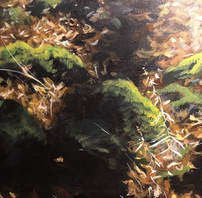
Of course, I can’t simply let my eyes devour beauty. That would be too easy and sensible. I have to gnaw on the issue of painting it; rendering fallen leaves numbers in the top rank of life’s enduring mysteries. In watercolour I feel certain that I would establish a loose underpainting of all of the bright tones and then gradually build from there by adding a consecutively stronger darks. But oil is so much more flexible. The traditional approach is, of course, to work from dark to light. It should be no surprise to me (or you) that I can’t locate any of my own autumn paintings but a large Anna Kuteshkova painting of a November woods (alas, no oak) hanging in our hall illustrates that traditional approach.
I might begin as usual with a ground of Indian red and then cover it with a broken field of burnt umbers and deep purples, before proceeding to the lighter bronzes, and ending with touches of yellow and white here and there where the light catches the tips of leaves. Then again, I might do the opposite and apply bright transparents over a base of Naples yellow hue, and then build depth with darker and more neutral glazes and a rigger brush to capture that intricate tapestry. A longer process but also capable of producing results.
The only thing I am sure of is that I will be using neither cadmium yellows or oranges nor cobalt blues or purples. The opacity of those pigments ensures that they can immediately sit like bright flags on top of a dark base but….oh, how dangerous these heavy metals are. Still,I sometimes just pull them out of my mom’s old paint box to admire them. Then I put them away again and head back to the river to try to memorize everything I see. Because it will change too.
But that's a good thing.

 RSS Feed
